Understanding the UI
Please note that Storyblok's documentation is currently undergoing major restructuring. Most resources can now be found on the dedicated documentation platform. This resource and others will be updated and moved shortly.
Overview Screen
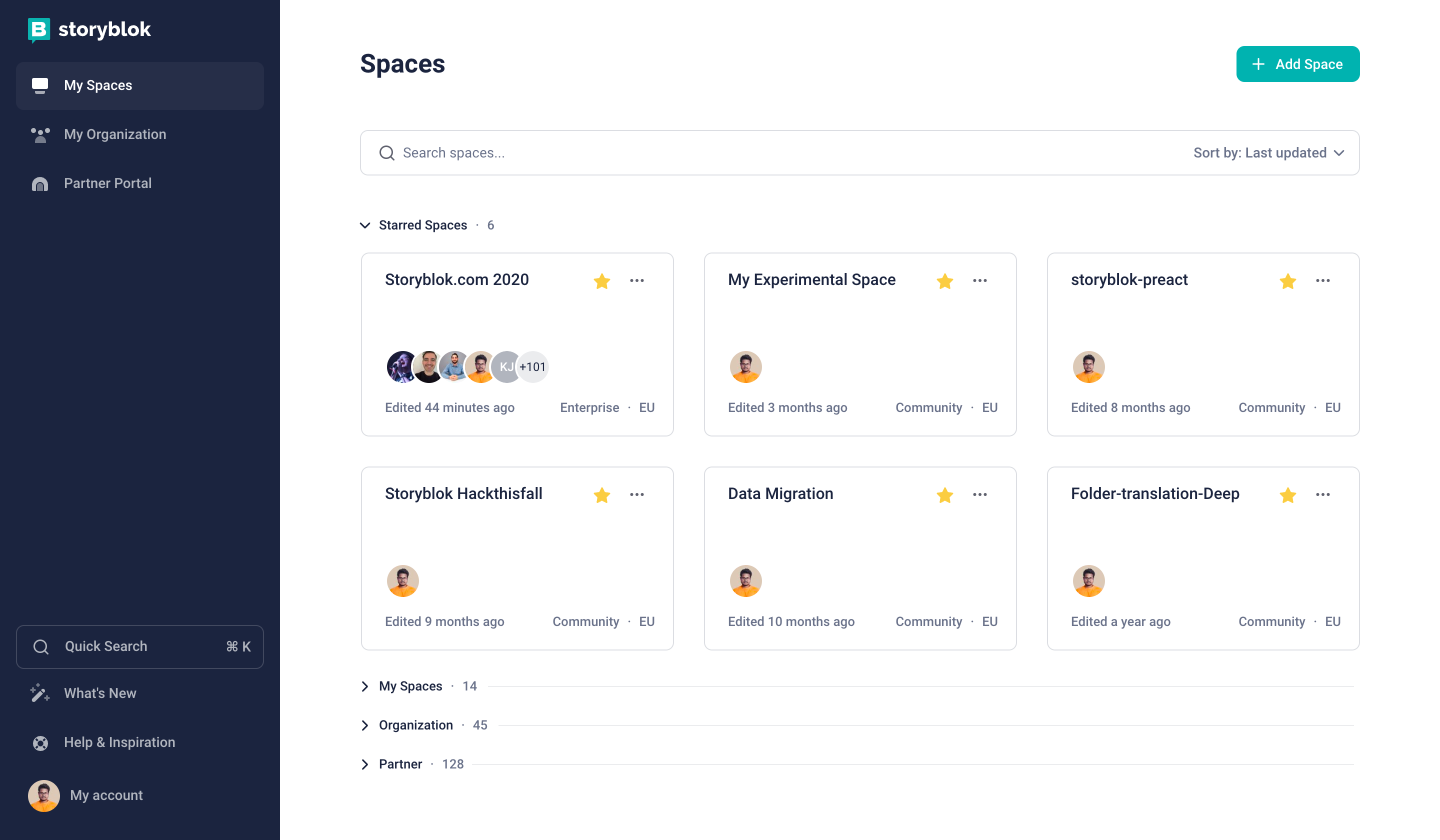
The first screen you see after logging in to Storyblok is the overview screen of all the spaces you have access to. As you can see in the image below, the screen is divided into two main sections.
- Sidebar {1} - on the left-hand side
- Main dashboard {2} - on the right-hand side.
Storyblok App
Sidebar
Functionalities of the Sidebar:
| Actions & Areas | Description |
|---|---|
| My Spaces {3} | This is selected by default. If this is selected you will see the spaces on the main dashboard. |
| My Organization {4} | The organization area allows you to get an overview of all your spaces and to manage users and your subscription. |
| Partner Portal {5} | Click here if you want to access the Partner Portal. If you're not a partner, the joining screen will be shown. |
| My account {6} | My account is present at the bottom of the Sidebar. You can use it to get to the following actions: - Open your account settings - Logout from Storyblok UI - Manage Plugins (Custom Field Types, Tools) |
Main Dashboard
This area is fully focused on displaying the spaces you have access to along with creating a new space.
Click on the + Add Space {1} and choose from the following options:
- New Space
- Example Space - A demo space with sample project integration.
You can even search {2} and sort {3} your spaces.
Create a list of your favourite spaces by clicking on the star {4} next to the space name. The three dots {5} next to the star give the following options:
- View - To enter the space.
- Settings - For space settings.
- Duplicate - To duplicate the space.
Assets are not copied when duplicating a space. If you want to copy all the assets you can do that using Management API.

Storyblok App
Space
The UI of the space is the part of the application where the majority of the users will spend most of their time.
Dashboard
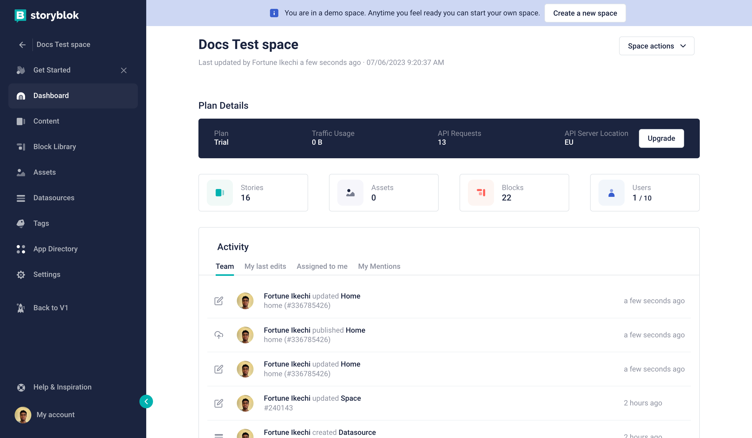
The space dashboard is the first section you see after entering your space. There are multiple variations of the screen according to your role. The three different variations of the dashboard are:
- Editor Dashboard (Regular Dashboard)
- Admin Dashboard
- Owner Dashboard
Editor (Regular) Dashboard
Editor Dashboard
| Area | Description |
|---|---|
| Last update {1} | Shows the last change in the space content along with the user who made the change. |
| Space information {2} | Shows the global stats of the space. It shows the number of all stories, assets, blocks and users. |
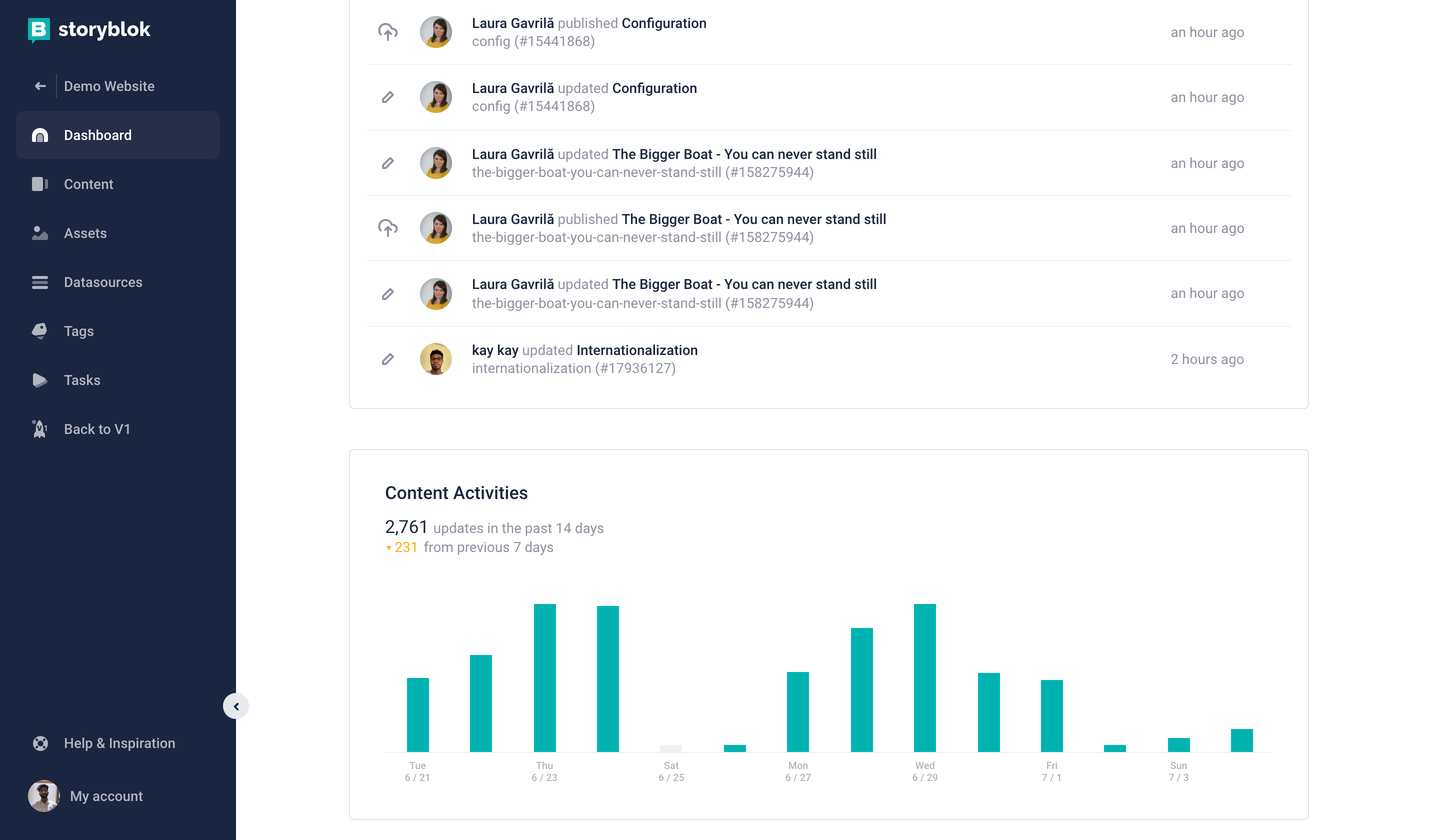
| Activity {3} | Shows the information about the changes in the space. It has three tabs - - Content: The recent content changes happening in the space by everyone. - My last edits: The recent changes by the logged-in user. - Assigned to me: This shows if something is assigned to the logged-in user. |
| Content Activities {4} | Represents the number of content activities in the last 14 days along with a per-day bar chart. |
Admin Dashboard
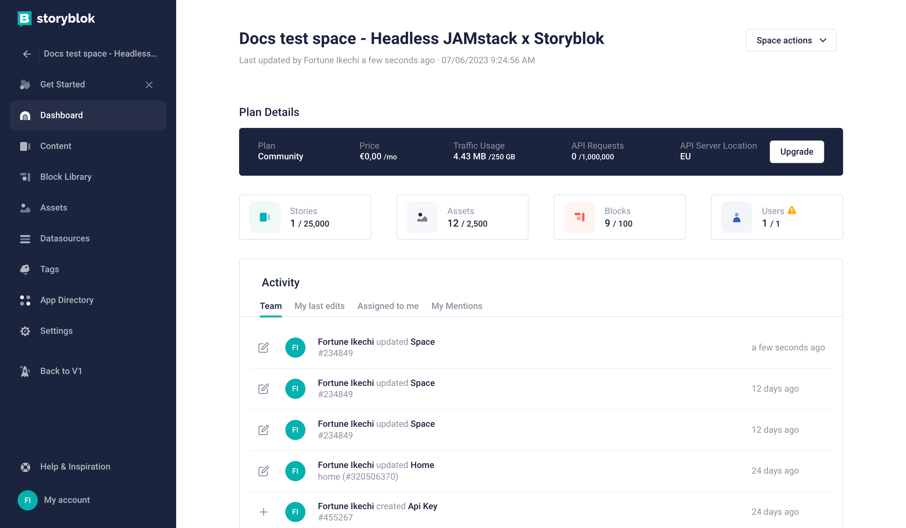
Along with the Editor Dashboard, the admin will see Space Actions {1}, Plan Details {2} , Team Activities {3} and API Requests {4}.
| Area | Description |
|---|---|
| Space Actions {1} | This dropdown gives you 3 actions - - Settings: To go to the settings of the space - Workflows: To edit workflows - Access Tokens: To see and edit access tokens |
| Plan Details {2} | Give details about the space plan - Plan, Traffic usage and day's API requests |
| Team Activities {3} | Instead of just content activities like in Editor Dashboard, this shows all the recent team activities like role addition, comments made, block edits and so on. |
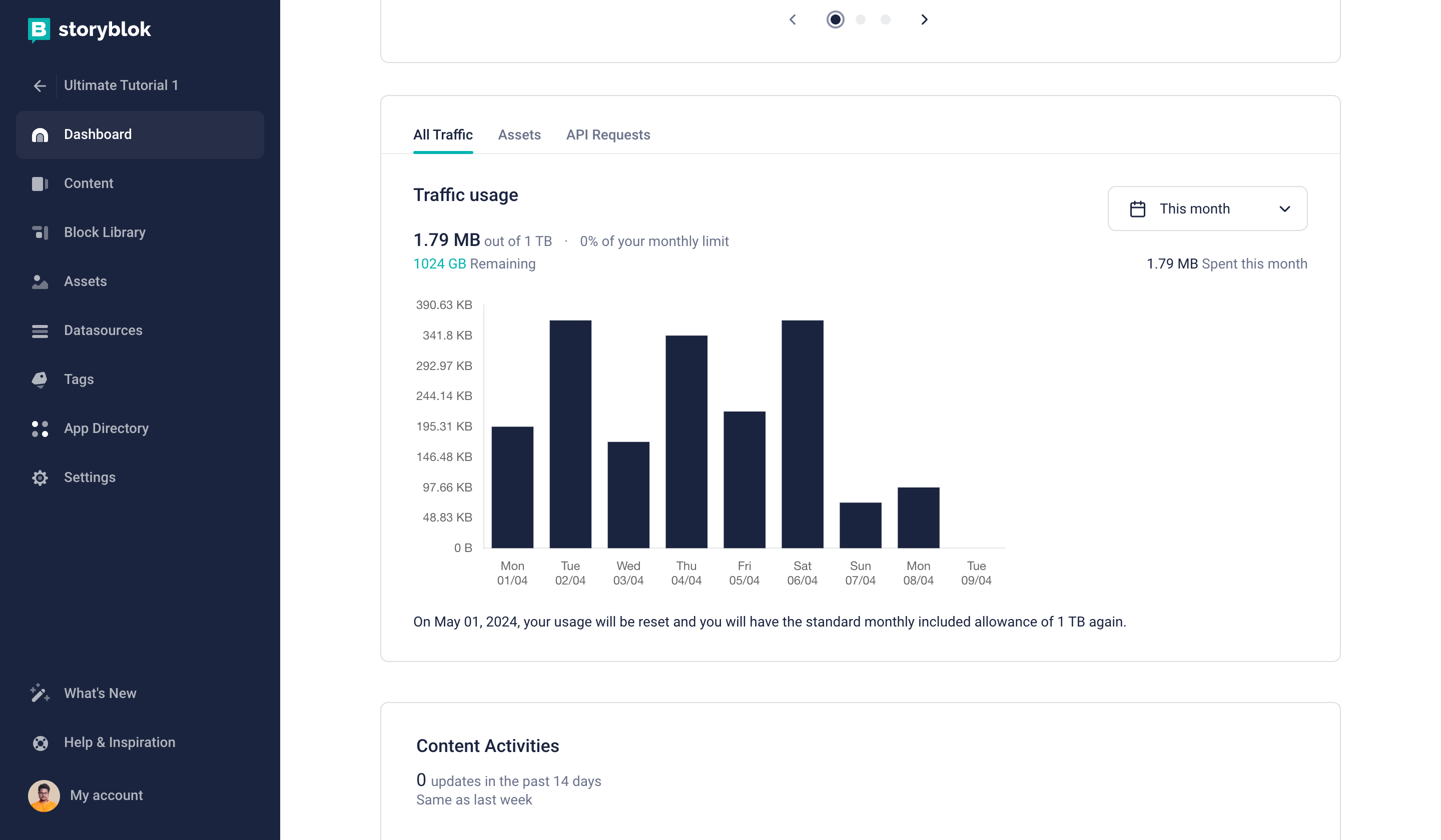
Admin Dashboard
As a space admin or owner, you can view detailed traffic usage analysis in the dashboard. It includes standard metrics for the last 30 days, 90 days, 6 months, and 1 year, along with tabs for asset traffic and API request traffic.
Owner Dashboard
The owner will see the same dashboard that an admin does, along with the functionality to see and update the subscription {1}
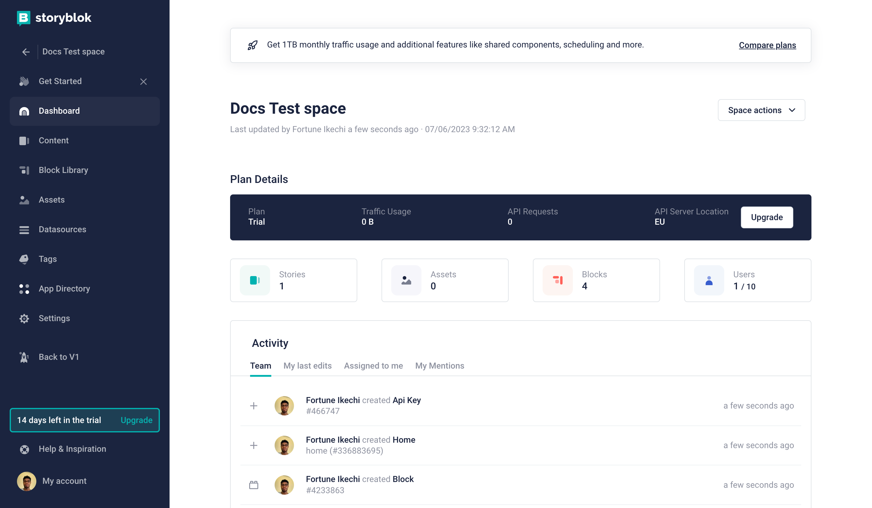
Owner Dashboard
Content
The “Content Area” is an overview of all your stories in the space. Here, you can create the hierarchical or flat structure of your content. By creating different folders for Stories you create a hierarchical structure, which you can use in different use cases.
To open the Story, click on the row in the table representing the Story. It opens the Editor in Visual or Form-only form (depending on the settings of the Story). You can navigate through the hierarchical folder structure by clicking on the folder as you would do in a regular operating system.
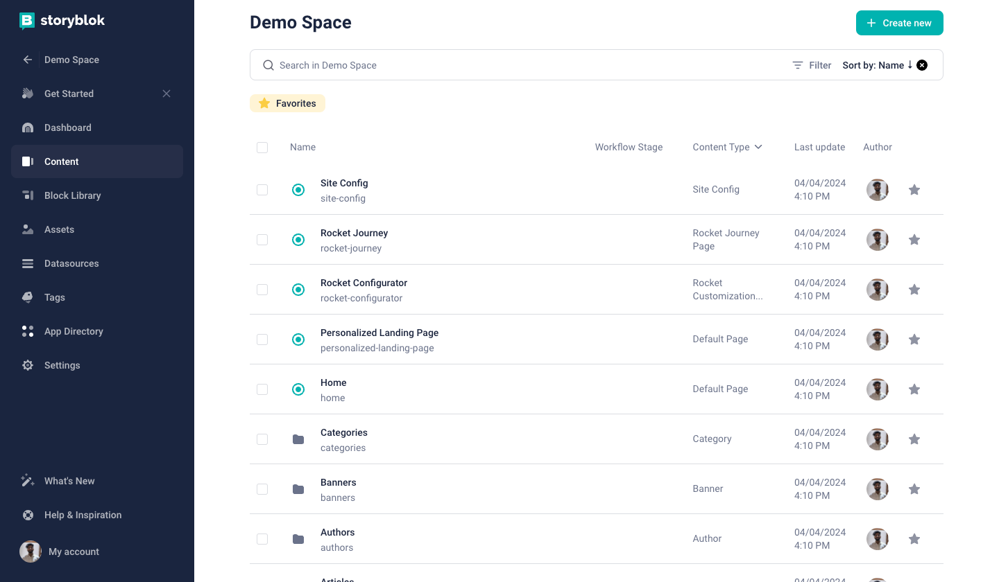
Content Section
| Area | Description |
|---|---|
| Create new {1} | Button to create a new folder or a new story. |
| Search {2} | You can search using the names of the Stories and Folders. |
| Filter {3} | Filter your content. |
| Sort {4} | Sort your content. |
| Multi-select {5} | It selects all the entries in the current folder and shows the select controls. |
| Status {6} | The green dot left to the name of the entry indicates the status: - Green - The entry and all its content is published. - Gray-green - The entry was already published, but there are some unpublished changes. - Gray - The entry was never published. If the story has been published once, the outer circle will have the same colour. |
| Favorite {7} | The star icon to add a story or a folder to favorites. |
| Favorites {8} | Favorites tag to filter all the favorite stories and folders. |
The functionality to add stories and folders as favorites is only available in business plan and above.
Ideation Room (Beta)
Ideation Room is a collaborative environment wherein content creators can work on content ideas and share them with their team members before embedding them in stories. Content creators can benefit from Ideation Room's built-in AI assistance feature to enhance content creation and collaborate with their colleagues in real time.
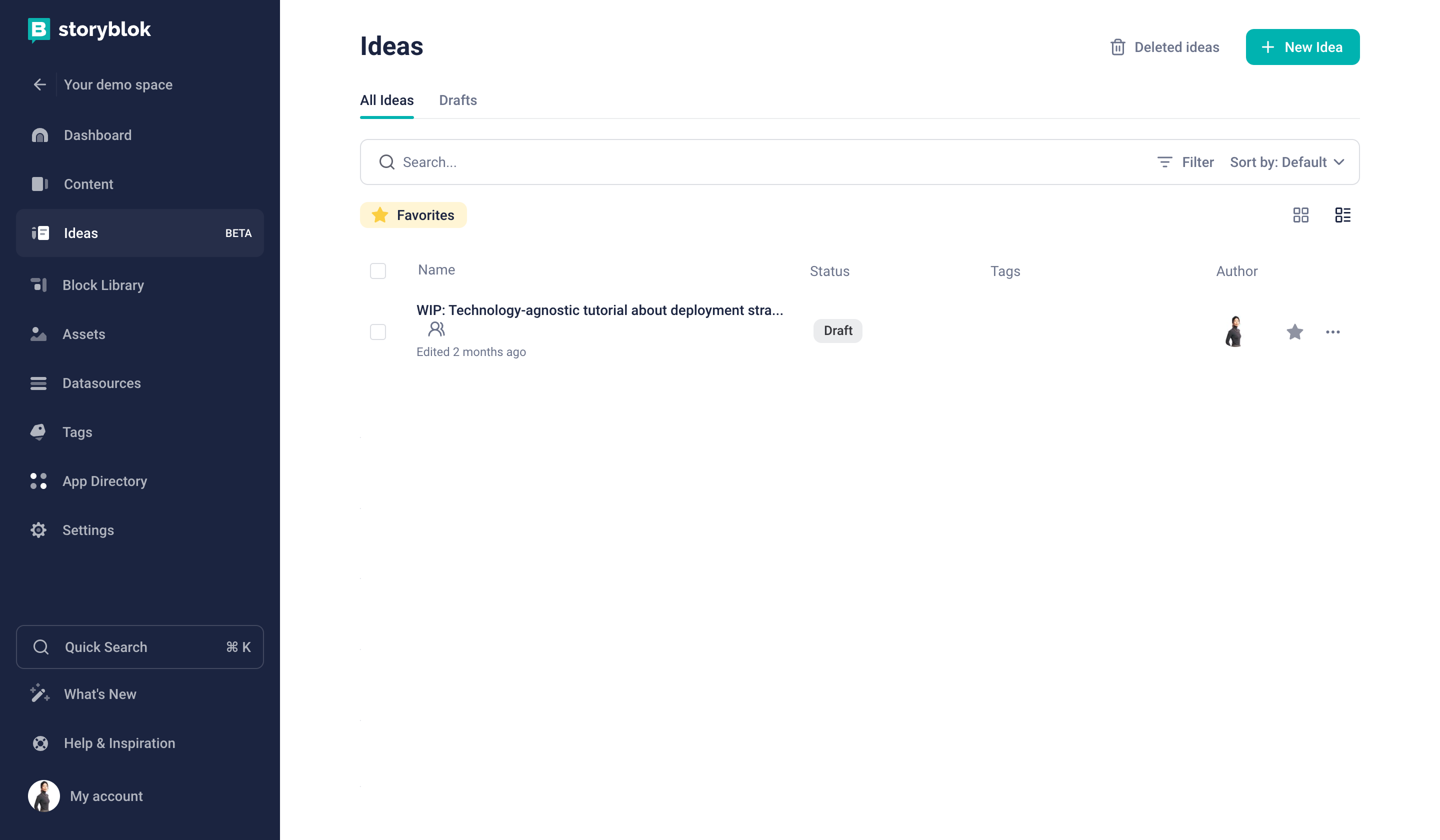
Ideation Room dashboard
| Area | Description |
|---|---|
| Deleted ideas {1} | Button to see deleted Ideas. |
| New Idea {2} | Button to create a new Idea. |
| All Ideas {3} | Overview of all Ideas |
| Drafts {4} | Overview of all draft Ideas |
| Search {5} | Search Ideas by the Ideas title |
| Status {6} | Status of the Ideas (Draft, In Review, Approved, Done) |
| Tags {7} | Tags to categorize Ideas |
| Author {8} | Authors of Ideas |
| Options {9} | Options to configure Ideas (Share, Settings, Delete) |
You can read more details about how to use this feature in the in-depth guide.
Block Library
In the Block Library, you get an overview of all the blocks (Nested, Content-Type and Universal) that are in the space. You can create folders to group the blocks for a better overview.
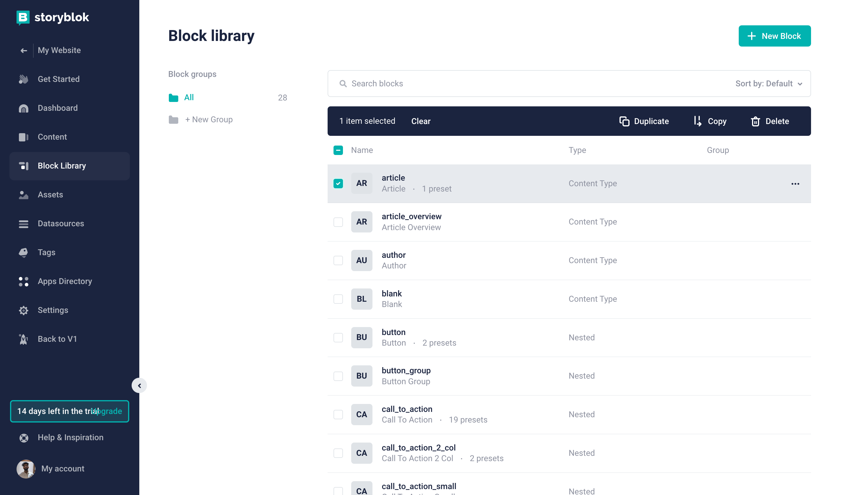
Block Library
| Area / Action | Description |
|---|---|
| New Block {1} | Creates a new Component (Nested / Content Type / Universal) |
| Block Groups {2} | List of block groups. |
| New Group {3} | Create a new block group. |
| Search blocks {4} | Search blocks by name. |
| Sort {5} | Sort blocks. |
| Multi-select {6} | Select/unselect all blocks in view. |
| Blocks menu {7} | Shows the actions. The block actions will be shown only if you select at least one component. |
| Presets {8} | Shows the number of presets for the block. |
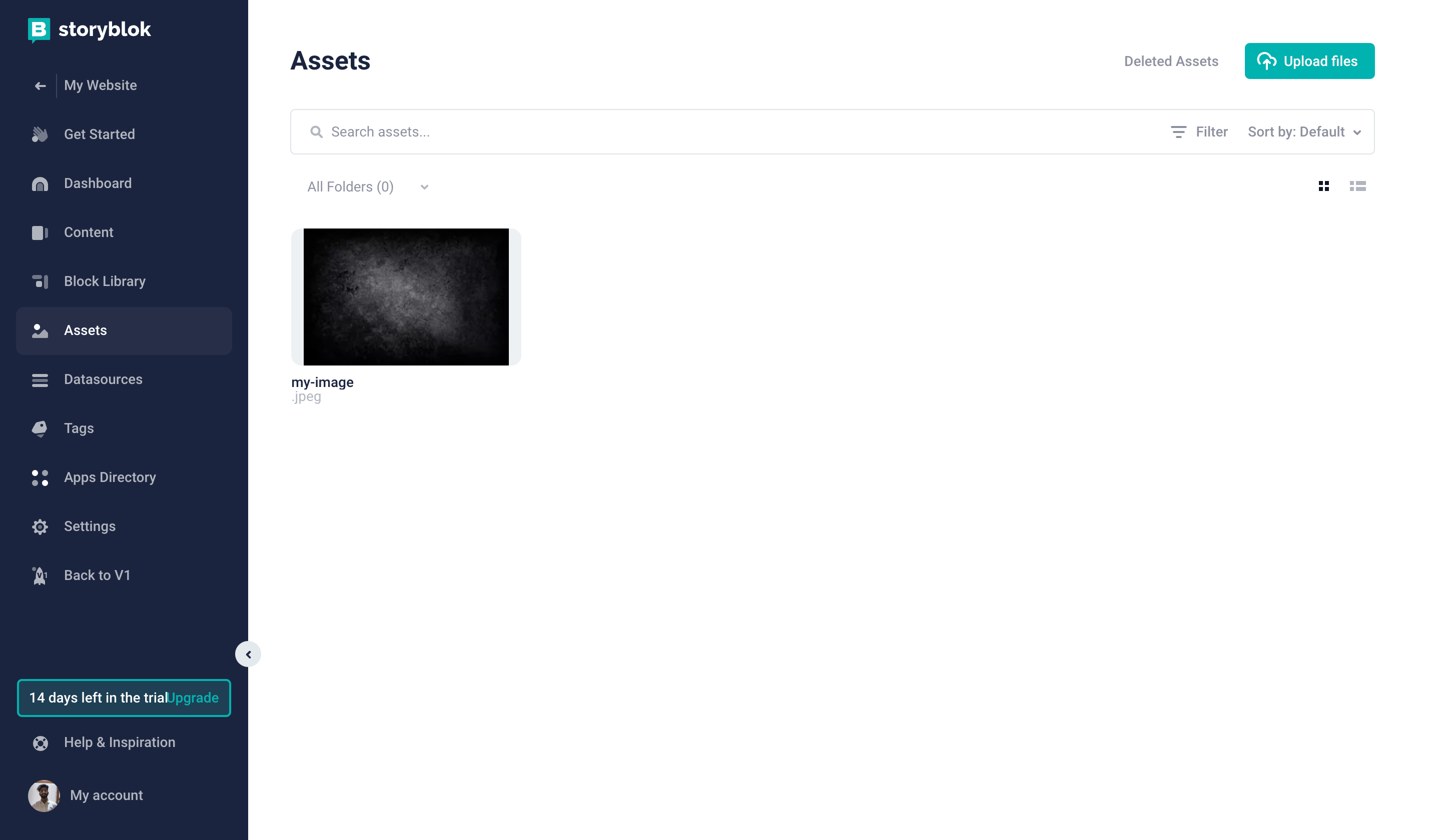
Assets
| Area / Action | Description |
|---|---|
| Search Assets {1} | Search for any asset using the name. |
| Deleted Assets {2} | See your deleted assets. |
| Upload files {3} | Upload your assets. |
| Filter {4} | Filter the assets. |
| Sort {5} | Sort the assets. |
| All Folders {6} | List of all asset folders. |
| View Toggle {7} | Use the two options to toggle between the list and tiles view |
Datasources
Datasource is a collection of key-value pairs. Create a new collection by clicking “New” button on the top right corner.
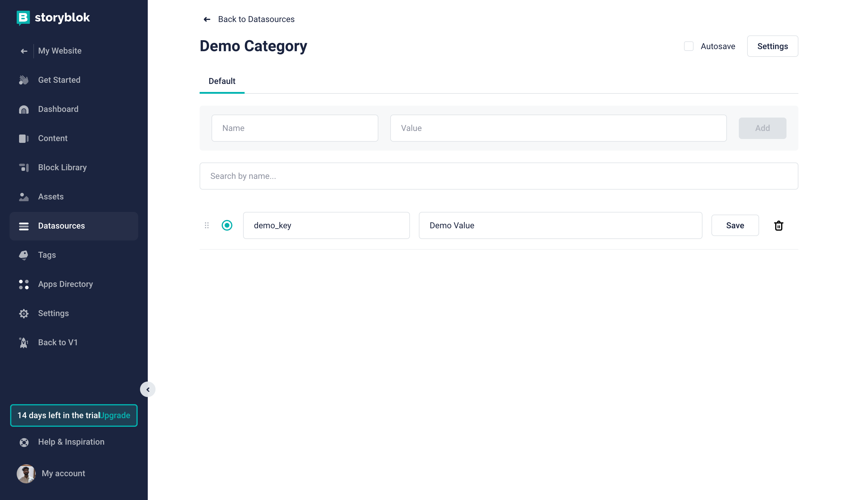
Datasources
| Area / Action | Description |
|---|---|
| Autosave {1} | Enable / Disable autosave |
| Settings {2} | It shows the advanced settings of the datasource, where you can import and export your datasource. You can also enable new dimensions (useful for translations) for the values. You will find the delete action and API URL of the datasource data. |
| Add {3} | Add new key-value pair. |
| Search {4} | Search by key. |
| Drag {5} | Drag and reorder the entries. |
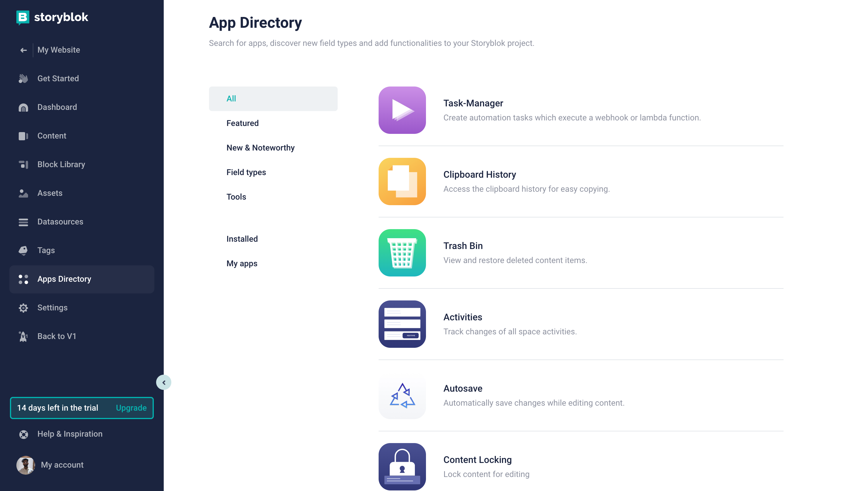
App Directory shows all apps that can be installed in the space. You can install or find out more about each App by clicking on its name, which opens a details page of the App.
Settings
The settings section of each space can differ according to your role and plan of the space.
The regular user can’t see the Settings at all - this section of the space can be accessed only by Admin and Owner of the space.
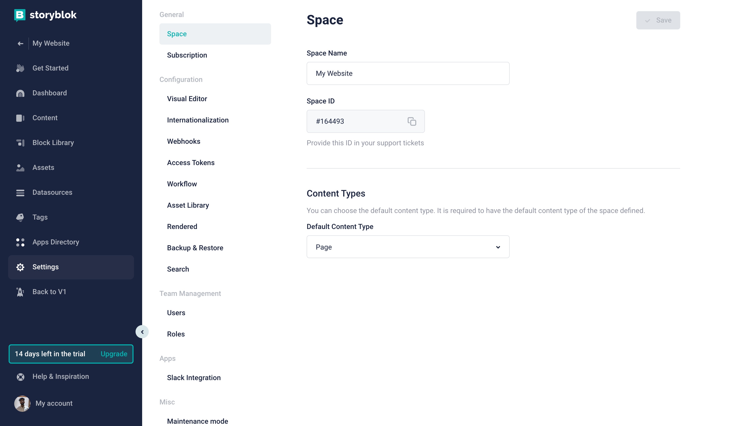
Settings
The space setting is divided into a few different tabs representing different areas of the settings. You can perform general actions of your space in this area and have a look at configuring your space to get a more detailed view of the functionalities.
Each change in settings has to be saved in the top right corner.
Editor
Storyblok offers two editor modes for each Story. You can always choose between the two and you can set-up the default mode to each folder in the content tree. These two modes/versions are:
- Visual Editor
- Form Only Editor
Open your Story in the Editor by clicking on the Story row in the content section.
Visual Editor
The visual editor is the key feature of Storyblok and it requires a configuration to work with your project. Follow this guide to find out how to properly configure the Visual Editor of your space.
The Visual Editor consists of the following parts:
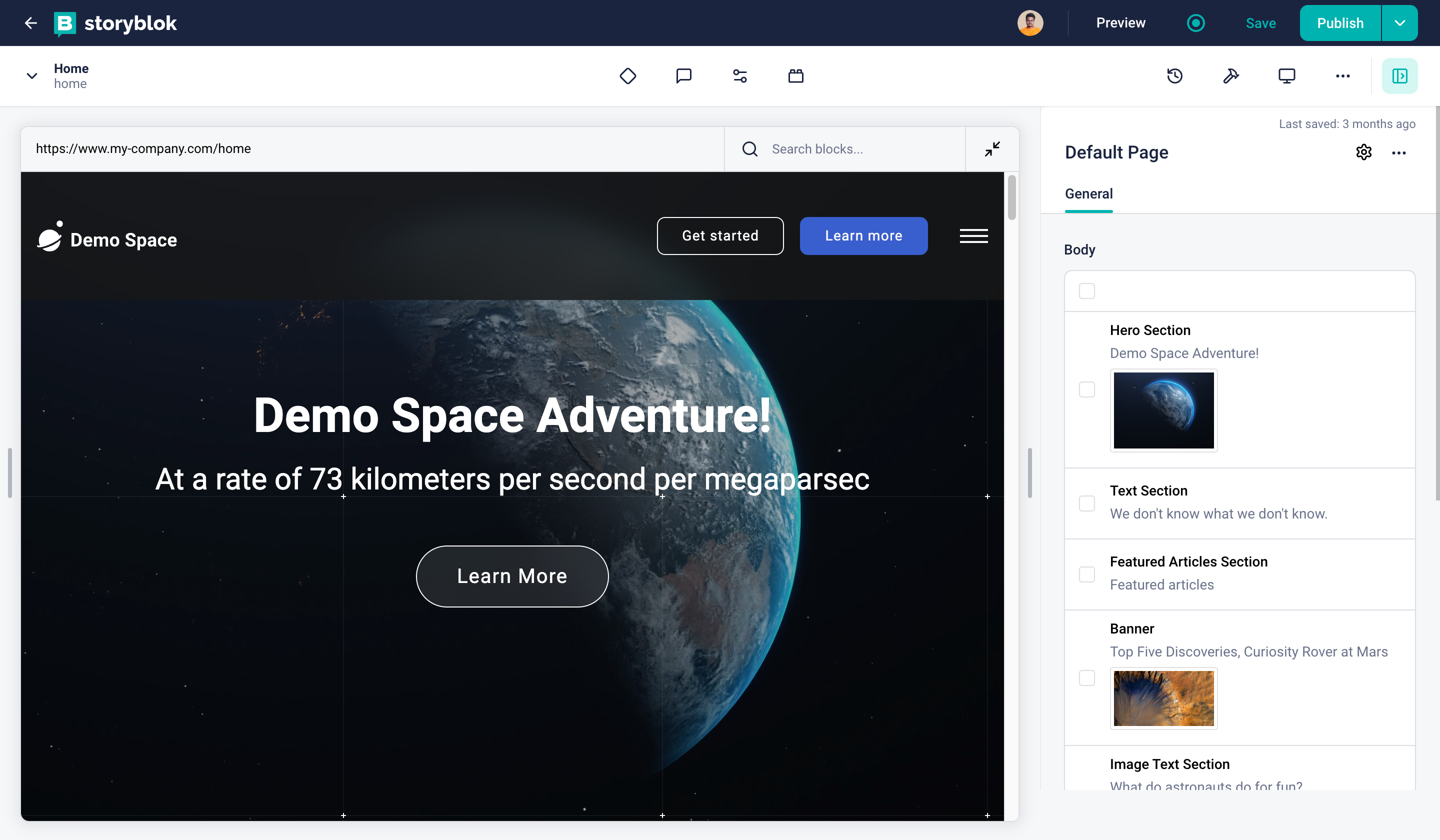
Visual Editor
| Area / Action | Description |
|---|---|
| Action Bar {1} | Offers basic Story action and is described in detail on next image/table |
| The Visual Editor Preview {2} | Will show a preview of the front-end of your project (website or application). It allows you to click and open the block's fields in the Content Area. |
| The Visual Editor Content Area {3} | Shows Blocks and Fields of the Story and allows you to edit them. |
Action Bar
The action bar on the top is divided into two sections, one with a dark background and the other one with a white background.

Action Bar
| Area / Action | Description |
|---|---|
| Back Button {1} | Returns back to the content section. |
| Active Users {2} | Shows the thumbnails of the users currently editing the opened entry. |
| Preview {3} | Opens the current entry in a new tab with draft content. |
| Published Status {4} | Shows the status of the story. - Green - The entry is published and there are no unpublished changes. - Gray-green - The contains unpublished changes, but it was already published before. - Gray - The entry was never published. If the story has been published once, the outer circle will have the same colour. |
| Save Button {5} | Saves content/changes as the draft version. |
| Publish Button {6} | Saves and changes the status of the entry on the published state. This action triggers the publish webhook. |
| Actions Dropdown {7} | Shows advanced actions, which can be strongly influenced by the installed apps. See Actions Dropdown Options right after Action Bar for more. |
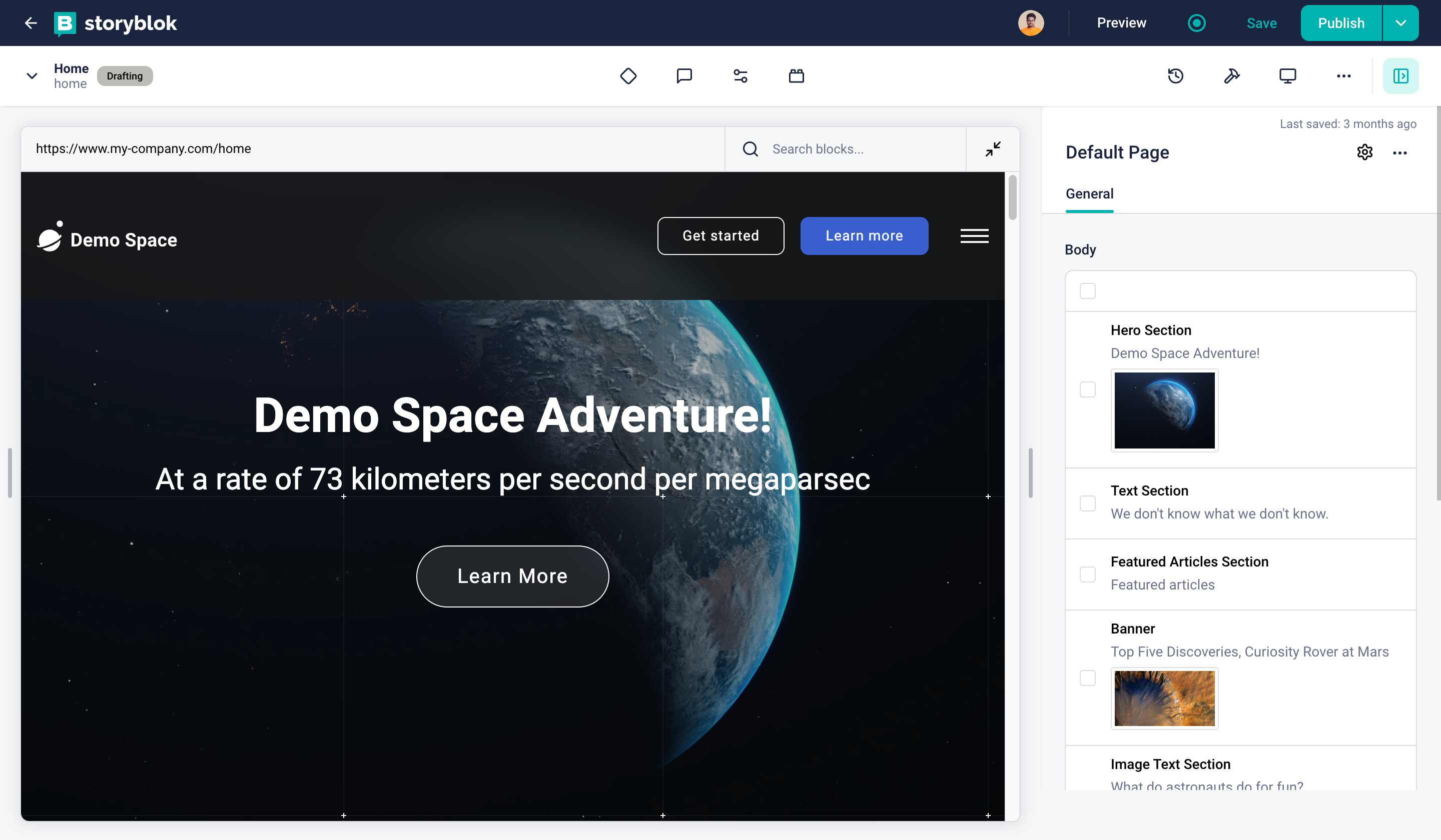
Action Bar
| Area / Action | Description |
|---|---|
| Content Browser Dropdown {1} | Opens up the content browser to help the user browse as well as create new story/folder without leaving the Visual Editor |
| Current Story {2} | Shows the name of the current story along with the slug. |
| Workflow Status {3} | Shows the current workflow stage (if any) for the opened story. |
| Workflow Stages {4} | Opens a menu for Page Status. It allows to change and set the workflow stages along with comments. Gives an option to assign the story to specific users and roles. |
| Discussions {5} | Shows open and resolved discussions. |
| Entry Configuration {6} | Changes the name and the slug of the Story. |
| Block Library {7} | Opens up the block library inside the current story. Shows the schema for the selected component on the right-hand side. A block can be added and edited. |
| Page History {8} | Opens a history popup where you can see the timeline of changes made on the entry. You can even roll back to any of the older versions. |
| Tools {9} | Opens the installed tools plugin section |
| Responsive View {10} | Show options to toggle between different screens (Desktop / Tablet / Mobile) |
| Options Dropdown {11} | Gives two options - - One to change the style of content area. (Overlay or Next to Content Browser) - One to restart the v2 tour. |
| Content Toggle {12} | Shows/Hides the content area |
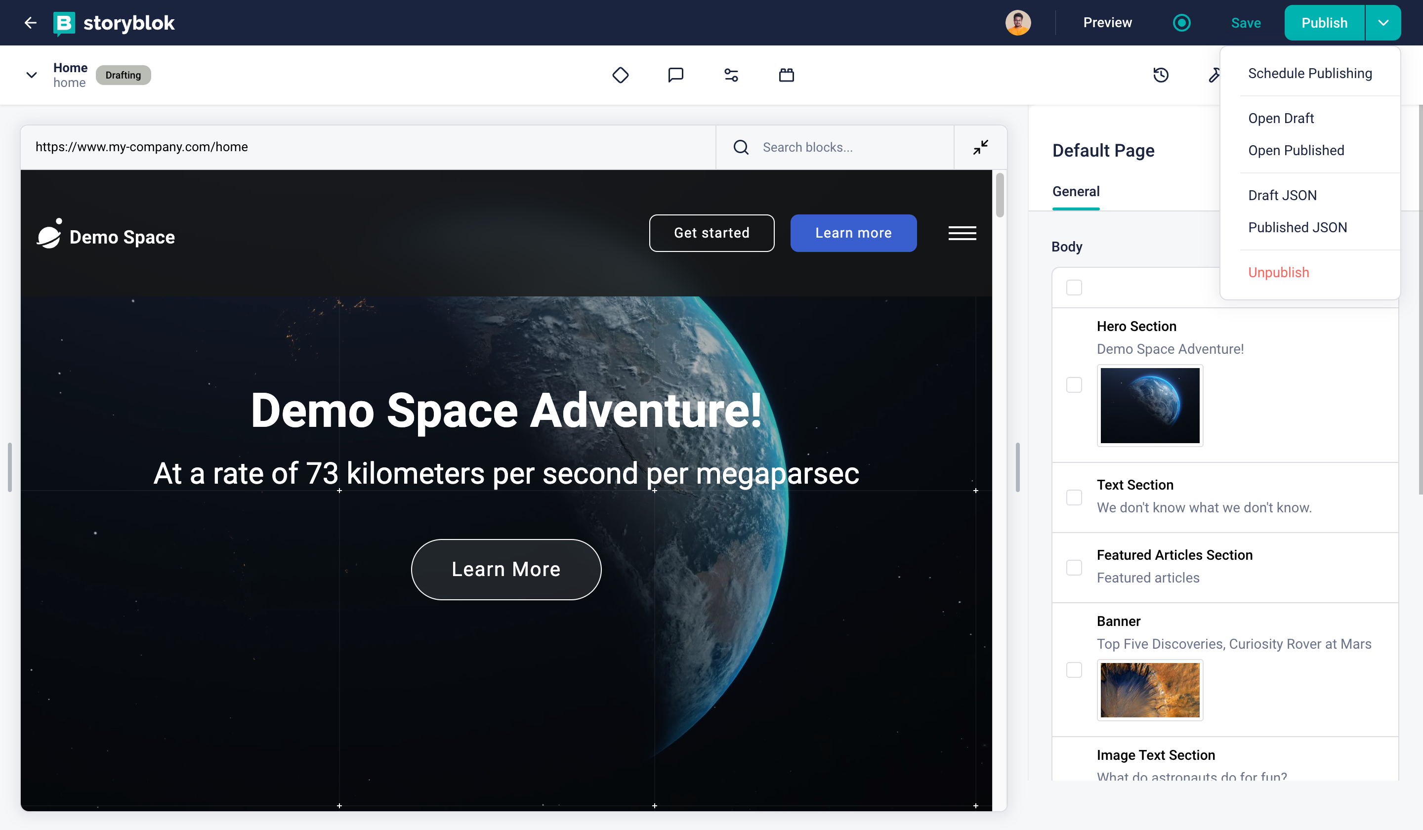
Action Dropdown
| Action | Description |
|---|---|
| Schedule Publishing {1} | Single Story Scheduling allows you the schedule the publication of one Story straight from the visual editor. |
| Open Draft {2} | Opens the current entry in the new tab with draft content. |
| Open Published {3} | Opens the current entry in the new tab with the last published content. |
| Draft JSON {4} | Opens draft JSON of the current entry in the new tab. |
| Published JSON {5} | Opens the last published JSON of the current entry in the new tab. |
| Page History {6} | Opens a history popup where you can see the timeline of changes made on the entry. You can even roll back to any of the older versions. |
| Unpublish {7} | Unpublishes the story. |
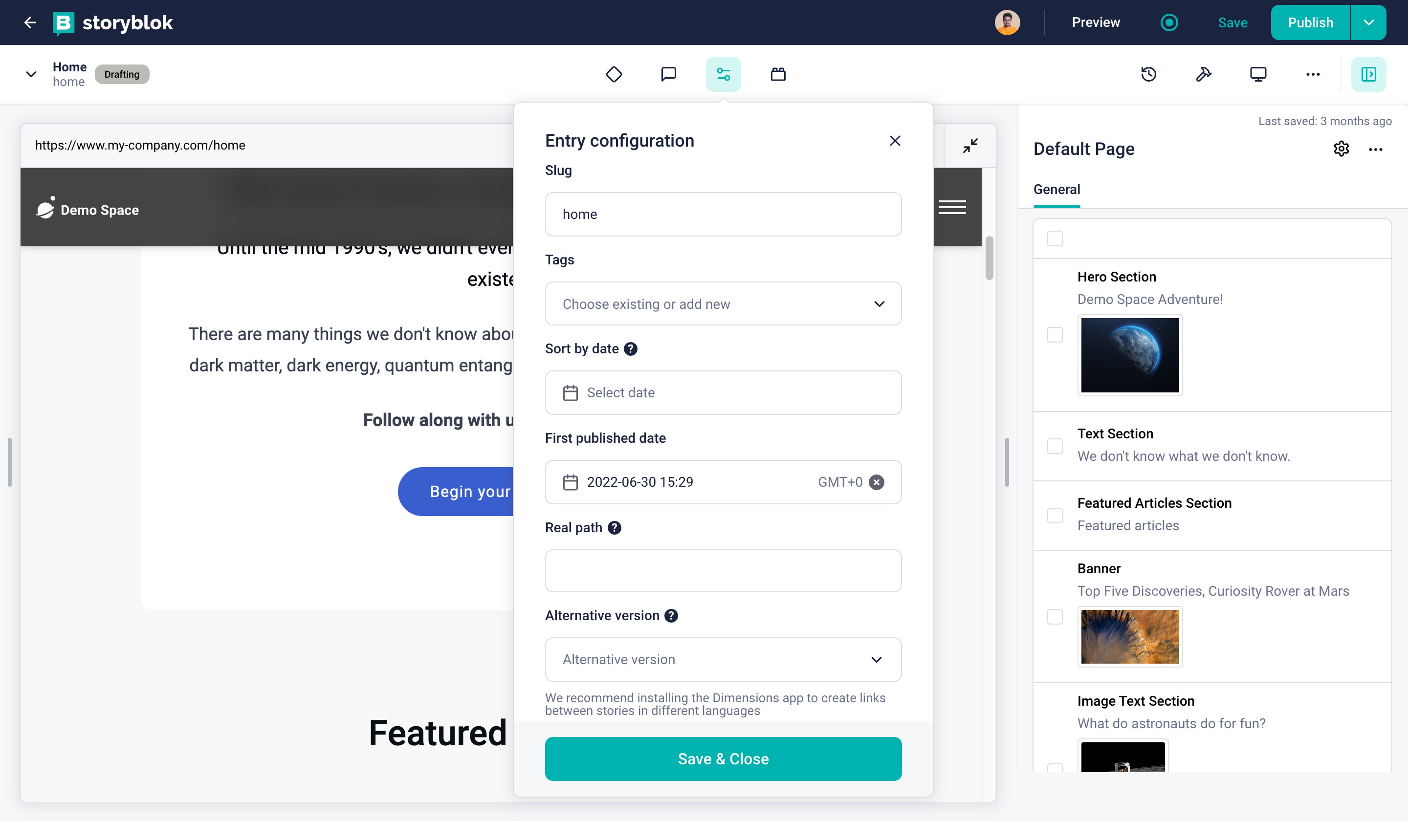
Entry Configuration
| Action | Description |
|---|---|
| Slug {1} | Changes the slug of the story. |
| Tags {2} | Sets tags to the entry. |
| Sort by date {3} | Allows sorting by date. |
| Real Path {4} | Defines where the visual editor should be open if the location differs from the slug. Mainly used on the homepage (index page) of the space, to tell the visual editor that home represents / . |
| Alternative version {5} | Alternative versions are used to make a linkage between different language or country versions of the content. |

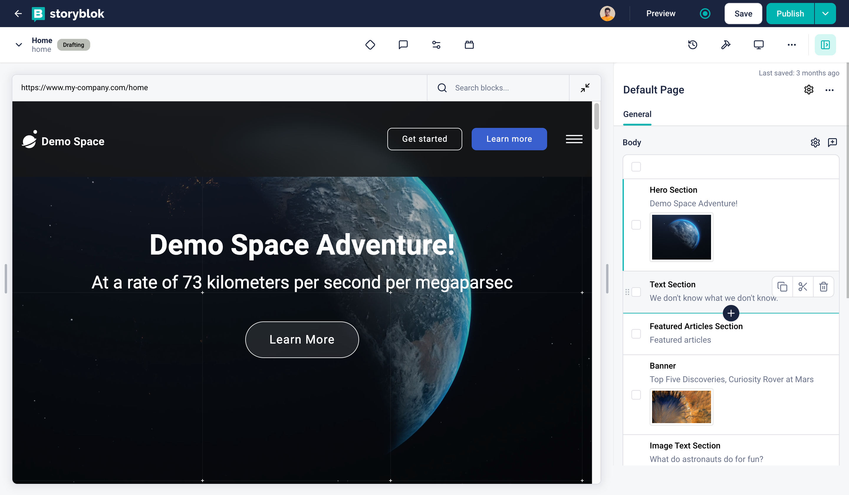
Visual Editor
| Action | Description |
|---|---|
| Preview URLs dropdown {1} | Switch between different environments configured in the space settings. |
| Content Navigator {2} | Search and navigate the story's content. |
| Form Mode Toggle {3} | Minimizes website preview area and enlarges the form area to fully focus on the content editing. |
Content Area
| Action | Description |
|---|---|
| Name of the block {1} | Displays the name of the selected block. |
| Options Dropdown {2} | Option to open the block in Block Library and Open Presets for the block |
| Edit Field {3} | Edit the field, like changing the type and setting other properties. |
| Start a discussion {4} | Start a field-level discussion. The discussions will be shown in the action bar discussions as well. |
| Drag {5} | Drag and change the order of the blocks. |
| Block Editor {6} | Shows the fields defined in the block schema and enables the editors to create/edit content. |
| Add Block {7} | In the case of the nested blocks, you can add an instance on another block into this array. |
Form Only Editor
There are numerous use cases for Form Only Editor. Use it for Stories which don’t have any own frontend representation layer or use it if you want to focus on creating content instead of getting disrupted by the visuals.
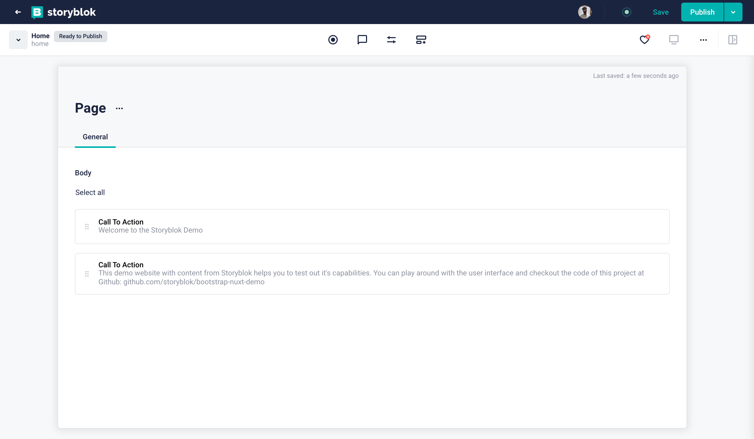
Form Only Edit Mode
You can switch between the Visual and Form Only Editor from the Entry Configuration on the Action Bar.
There is an option to switch between the Edit modes {1}
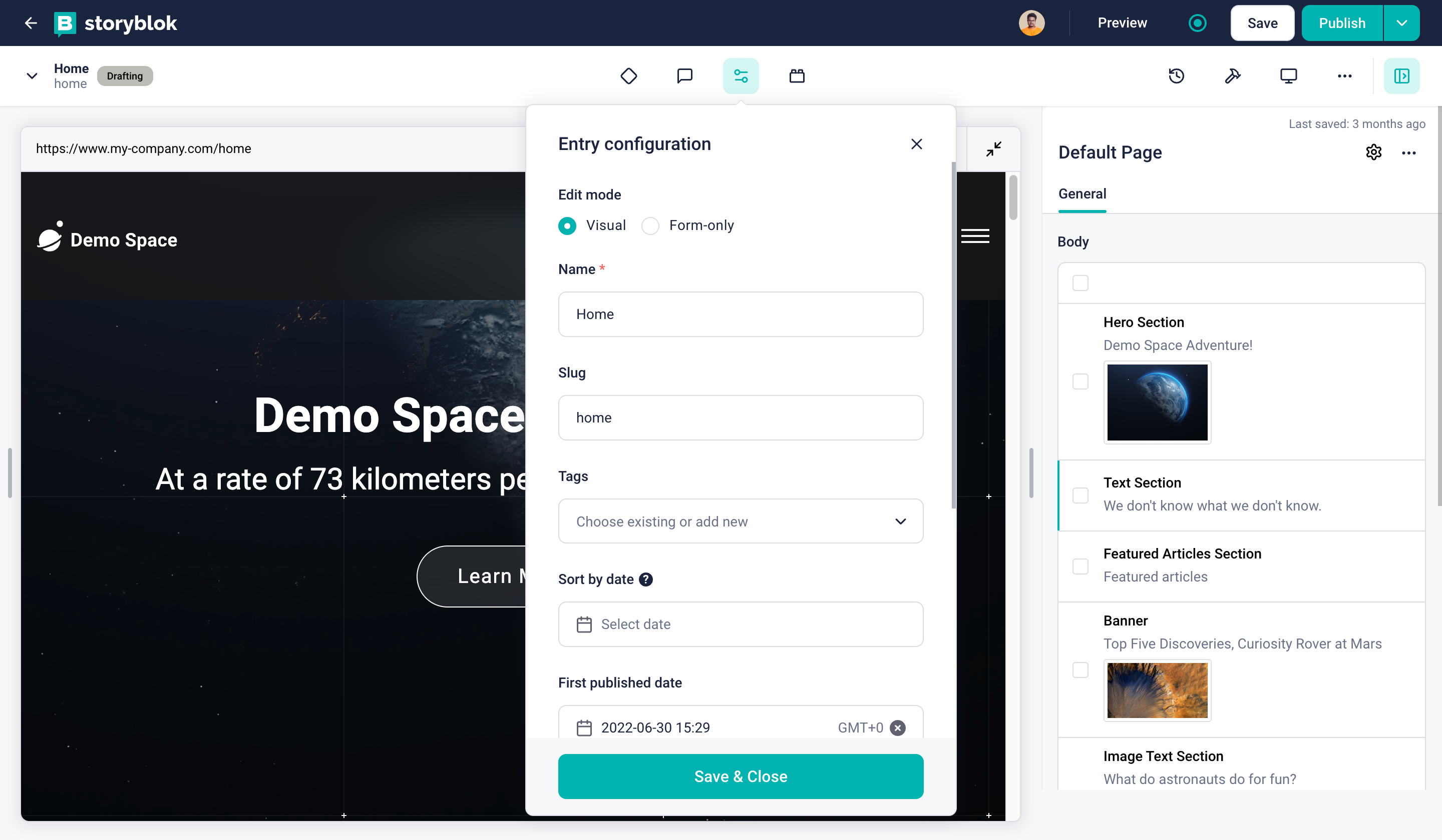
Switch Edit Mode
You can disable the Visual Editor in the settings of the folder in the content area.
Visualize unpublished relations
Now, you can visualize unpublished relations between stories. When a story contains links to other stories that are not yet published, it can impact the display of the live website. To prevent unexpected behavior, we highlight these unpublished relations when you click on the publish button.
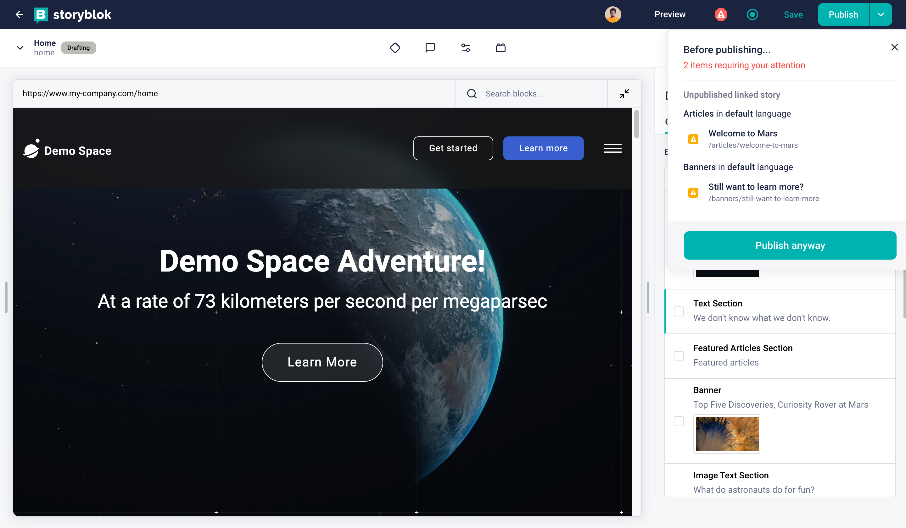
Visualise unpublished relations
This feature is available for users on the Business plan and during the trial period.