Add a headless CMS with Live Preview to SvelteKit in 5 Minutes
Storyblok is the first headless CMS that works for developers & marketers alike.
This short tutorial will show you how to integrate the Storyblok API into a SvelteKit app. We will also enable the real-time editing experience in the Visual Editor with the Storyblok JS Bridge - so that you can see your changes right away. At the end of this article, you will have a SvelteKit application that renders components filled with data from Storyblok.
If you don't know what a Headless CMS is or what Storyblok does, please read first the Storyblok Guide (opens in a new window).
If you’re in a hurry, check out the code on Github!
Environment Setup
Requirements
To follow this tutorial, make sure to meet these requirements:
- Basic understanding of SvelteKit (opens in a new window) and Javascript
- Node.js (opens in a new window)version 18 & npm version 8
- An account in the Storyblok App (opens in a new window)
Please note that you have to use npm - unfortunately, we are currently not supporting yarn or pnpm for this SDK.
Create a Sveltekit project
Let's follow the official SvelteKit documentation (opens in a new window) to create an app with the latest version of SvelteKit. Here, you will be presented with a few options - for the sake of this tutorial:
- Select yes (y) to proceed
- Opt for the 'Skeleton Project'
- No need for type checking with Typescript for now
- If you like, you can add ESLint and Prettier
- No need for browser testing with Playwright for now
Then, cd into your project, npm install & start your skeleton Sveltekit project.
npm create svelte@latest sveltekit-ultimate-tutorial-series
cd sveltekit-ultimate-tutorial-series
npm install
npm run devThere is a Sveltekit Plugin for VS Code that helps with syntax highlighting.
You should now be able to see the SvelteKit App in your browser when you open http://localhost:5173/:

By default, SvelteKit runs on port 5173 - if you'd like to change that, Rodney created a great tutorial on changing the SvelteKit Port if that's something you are interested in.
Setting up a HTTPS Connection
V2 works with a secure connection through HTTPS. To set this up with our SvelteKit project, we will install the vite plugin basic ssl like so:
npm i @vitejs/plugin-basic-sslThen, in our vite.config.js, let's import basic ssl and set the https to true:
import { sveltekit } from "@sveltejs/kit/vite";
import { defineConfig } from "vite";
import basicSsl from "@vitejs/plugin-basic-ssl";

export default defineConfig({
  plugins: [sveltekit(), basicSsl()],
  server: {
    https: true,
  },
});
We also have to add the apiOptions to the StoryblokInit function in the +layout.js and set https to true:
...
export async function load() {
  storyblokInit({
    accessToken: "your-access-token",
    use: [apiPlugin],
    apiOptions: {
      https: true,
    },
  });
Configuration of the space
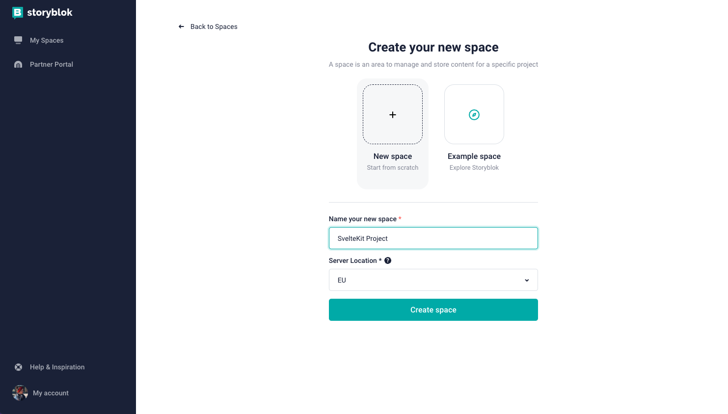
Create a new space in the Storyblok app by clicking + Create new space and choosing the Create new space {1} option. Pick a name for it {2}, and choose your server location. The server location should match the one you will later set in your code.
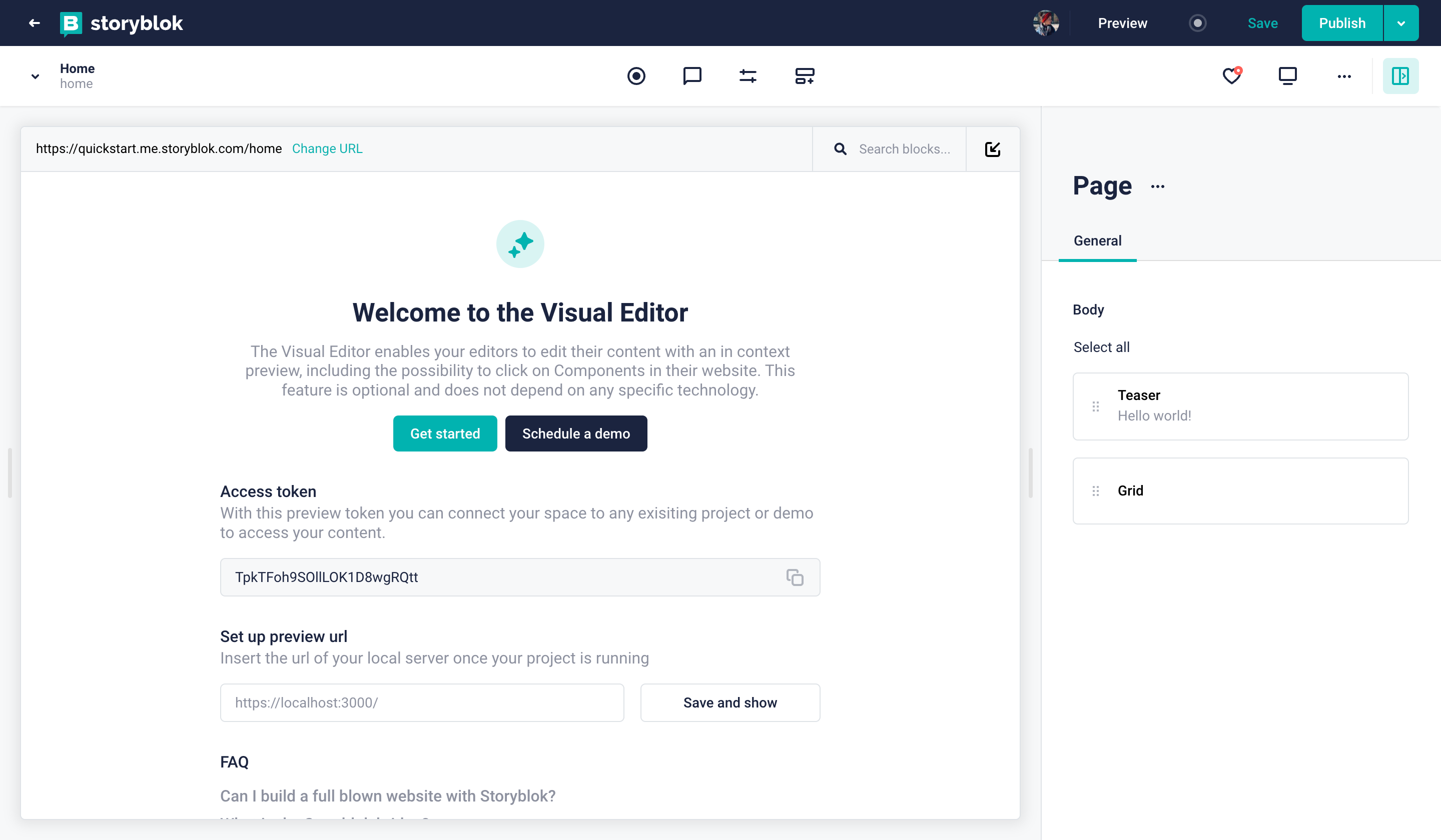
Now, a Storyblok space with sample content has been created. If you open the Home story you will see the Visual Editor on your screen:
Understand what represents Story in our Storyblok Guide.
Enabling the Visual Editor
To see your website in the Storyblok Visual Editor (opens in a new window) you need to set the default environment URL. For that, in your space, open Settings > Visual Editor {1} and set the Location field to https://localhost:5173/ {2} and save {3} .
Now go back to the Home story under the Content section. You'll see the Visual Editor when you open it, but you won't see your SvelteKit application yet.
Now, open the Entry Configuration tab {1} on the right-hand form, and set the Real Path to “/” {2}. Save, and if you’re still running your SvelteKit app, you will see it now in the Visual Editor.
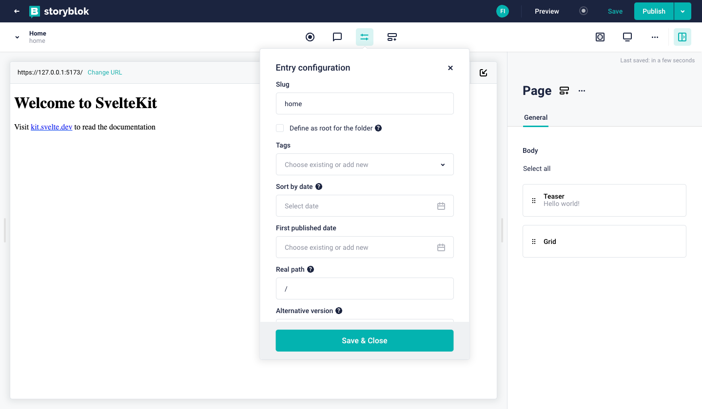
Sveltekit Start screen in the Visual Editor
Connecting SvelteKit to Storyblok
First of all, let’s install @storyblok/svelte (opens in a new window), our official SDK for all things Svelte & SvelteKit:
npm install @storyblok/svelteFor now, we also need to install Typescript, as it is required by the library. We are working on fixing this. npm install typescript -D
It allows you to interact with Storyblok API and enable the real-time editing experience. Let's configure it.
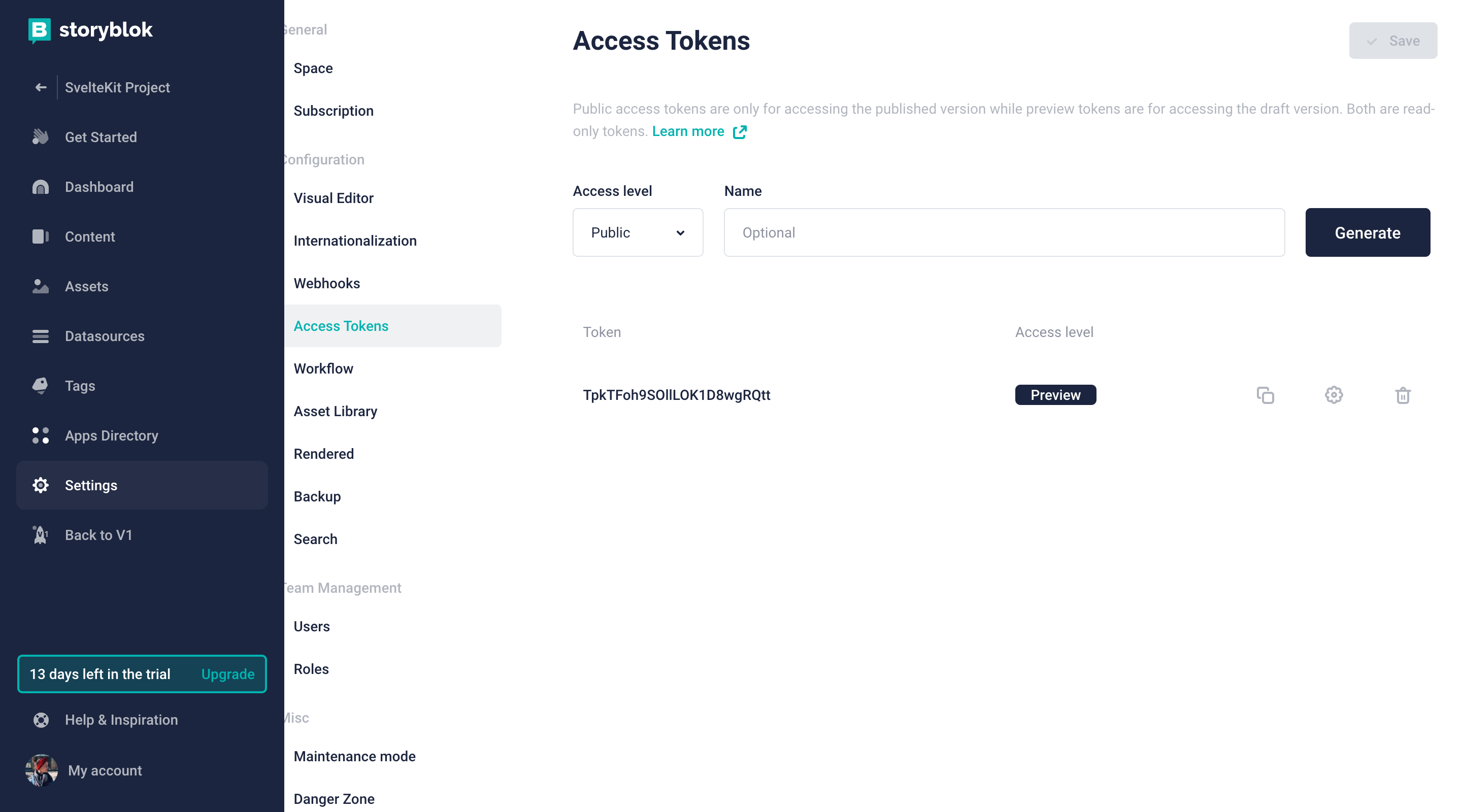
First of all, you need to grab your access token from your space Settings > Access Token:
Now in our routes directory, we can create a +layout.js file to initialize our library, add the API Plugin and the access token to our space.
import { apiPlugin, storyblokInit, useStoryblokApi } from "@storyblok/svelte";

/** @type {import('./$types').LayoutLoad} */
export async function load() {
  storyblokInit({
    accessToken: "W1vLyxT5rQ15jBpANjnv0gtt",
    use: [apiPlugin]
  });
  let storyblokApi = await useStoryblokApi();

  return {
    storyblokApi: storyblokApi,
  };
}
storyblokInit sets up the connection with the space. It initializes the Storyblok Bridge (opens in a new window), that allows us to enable the real-time editing experience inside the Visual Editor. The function also provides an instance of the Storyblok API client that we can use to retrieve content from Storyblok.
Setting the correct region
Depending on whether your space was created in the EU, the US, or China, you may need to set the region parameter of the API accordingly:
eu(default): For spaces created in the EUus: For spaces created in the USap: For spaces created in Australiaca: For spaces created in Canadacn: For spaces created in China
Here's an example for a space created in the US:
apiOptions: {
  region: "us",
},Note: For spaces created in the United States or China, the region parameter must be specified.
If you are planning to use the Storyblok API client to call the REST API, make sure to include the ApiPlugin when initializing the storyblokInit() function.
We will wrap our storyblokInit in an asynchronous load function and return the storyblokAPI after initialization to make it available after the initial load.
import { apiPlugin, storyblokInit, useStoryblokApi } from "@storyblok/svelte";

/** @type {import('./$types').LayoutLoad} */
export async function load() {
  storyblokInit({
    accessToken: "W1vLyxT5rQ15jBpANjnv0gtt",
    use: [apiPlugin],
  });
  let storyblokApi = await useStoryblokApi();

  return {
    storyblokApi: storyblokApi,
  };
}
Rendering Dynamic Components in the SvelteKit App
The core idea of using Storyblok for this particular use case is the following:
- Content managers (even if it’s only yourself) can create pages (or stories) composed of different components (or bloks)
- Developers receive the page in the JSON format by using the Storyblok API and can render components accordingly (this is what we want to accomplish in our SvelteKit app)
When you create a new space from scratch, Storyblok automatically creates four default components for you:
page: Content type blokgrid: Nested blokfeature: Nested blokteaser: Nested blok
You can find all of these in the Components section of your space.
Understand the difference between the nested components and content type in our Structures of Content tutorial.
Creating SvelteKit Components
Let's create the counterparts of the four components above in our SvelteKit app. To do that, create a new components folder under the src directory with the following components:
<script>
  import { storyblokEditable } from '@storyblok/svelte';

  export let blok;
</script>

<div
  use:storyblokEditable={blok}
  class="w-full p-12 bg-[#f7f6fd] rounded-[5px] text-center"
>
  <h2 class="text-2xl text-[#1d243d] font-bold">{blok.name}</h2>
</div><script>
import { storyblokEditable, StoryblokComponent } from '@storyblok/svelte';
export let blok;
</script>
<div
use:storyblokEditable={blok}
class="container mx-auto grid md:grid-cols-3 gap-16 place-items-center"
>
{#each blok.columns as blok}
<div class="flex-auto px-6">
<StoryblokComponent {blok} />
</div>
{/each}
</div><script>
import { storyblokEditable, StoryblokComponent } from "@storyblok/svelte";
export let blok;
</script>
{#key blok}
<div use:storyblokEditable={blok} class="px-6">
{#each blok.body as blok}
<StoryblokComponent {blok} />
{/each}
</div>
{/key}<script>
import { storyblokEditable } from "@storyblok/svelte";
export let blok;
</script>
<h3 use:storyblokEditable={blok} class="py-8 mb-6 text-5xl font-bold text-center">
{ blok.headline }
</h3>The use:storyblokEditable={blok} action at the root of each component that you are loading in your storyblokInit is what makes the component editable.
Use the StoryblokComponent to load them by passing the blok property.
To be able to make the most of the Visual Editor and JS Bridge and display all changes in real-time, in Svelte, we have to wrap our page component in a {#key} block. This will destroy and recreate the contents every time the value changes. This way, we will be able to drag and drop our components and see the changes on the fly. Find out more about the key blok in the Svelte docs or have a look at our Stackblitz example for the implementation.
Once you are done creating new components, be sure to add them to the storyblokInit function in the +layout.js:
import Feature from "../components/Feature.svelte";
import Grid from "../components/Grid.svelte";
import Page from "../components/Page.svelte";
import Teaser from "../components/Teaser.svelte";
import { apiPlugin, storyblokInit, useStoryblokApi } from "@storyblok/svelte";

/** @type {import('./$types').LayoutLoad} */
export async function load() {
  storyblokInit({
    accessToken: "EDW3UXLubxQzwAePqa8UEwtt",
    use: [apiPlugin],
    components: {
      feature: Feature,
      grid: Grid,
      page: Page,
      teaser: Teaser,
    },
  });
  let storyblokApi = await useStoryblokApi();

  return {
    storyblokApi: storyblokApi,
  };
}
Optional: Use TailwindCSS to style your components
If you had a sneak peek at our Stackblitz demo, you might have noticed that we’ve been using Tailwind classes in our components. In order to make these work, let’s quickly add Tailwind to our SvelteKit project with svelte-add (opens in a new window) by running:
npx svelte-add tailwindcss
npm install
This should first of all import svelte-preprocess and configure it to process <style> blocks as PostCSS. Make sure preprocess is imported in your `svelte.config.js` and `postcss` set to 'true', like so:
import preprocess from "svelte-preprocess";
import adapter from "@sveltejs/adapter-auto";
/** @type {import('@sveltejs/kit').Config} */
const config = {
  kit: {
    adapter: adapter(),
  },
  preprocess: [
    preprocess({
      postcss: true,
    }),
  ],
};
export default config;
Adding Tailwind to your project will also add a `tailwind.config.js` including all the template files (no need to make any changes here):
const config = {
  content: ["./src/**/*.{html,js,svelte,ts}"]
};
module.exports = config;
And a postcss.config.cjs (again, no need to make changes):
const tailwindcss = require("tailwindcss");
const autoprefixer = require("autoprefixer");
const config = {
  plugins: [
    //Some plugins, like tailwindcss/nesting, need to run before Tailwind,
    tailwindcss(),
    //But others, like autoprefixer, need to run after,
    autoprefixer,
  ],
};
module.exports = config;
Using the svelte-add tailwindcss command will also create a +layout.svelte in which your app.css will be imported.
<script>
	import '../app.css';
</script>

<slot />
To learn more, you can also checkout the official docs on adding Tailwind to a SvelteKit project (opens in a new window).
If you want to use postcss, be sure to name your files accordingly.
The blok is the actual blok data coming from Storyblok's Content Delivery API.
Fetching the Content
In order to fetch the content, we will use another load function and receive the Storyblok API from the parent in the +layout.js.
Once we have received it, we can use storyblokAPI to get the stories from the Storyblok CDN by calling the respective path - in this case "cdn/stories/home":
export async function load({ parent }) {
  const { storyblokApi } = await parent();

  const dataStory = await storyblokApi.get("cdn/stories/home", {
    version: "draft",
  });

  return {
    story: dataStory.data.story
  };
}
Listening to changes in the Visual Editor
Now to listen to our changes from the Visual Editor, we need to set up the the Storyblok Bridge. With the Storyblok Bridge, we'll be able to see our changes in real-time. For this, we'll create a +page.svelte file and import our useStoryblokBridge and StoryblokComponent from storyblok/svelte.
 <script>
    import { onMount } from "svelte";
    import { useStoryblokBridge, StoryblokComponent } from "@storyblok/svelte";

    export let data;

    onMount(() => {
        useStoryblokBridge(
            data.story.id,
            (newStory) => (data.story = newStory)
        );
    });
</script>

<div>
    {#if data.story}
        <StoryblokComponent blok={data.story.content} />
    {/if}
</div>
Please note that we wrapped our StoryblokComponent in an if statement here to check that we have actually received our story.
One last important step: Be able to load everything correctly, be sure to include an alias for our storyblok/svelte module, like so:
    alias: {
      '@storyblok/svelte': './node_modules/@storyblok/svelte',
    },
Your complete svelte.config.js should now look like this:
import preprocess from "svelte-preprocess";
import adapter from "@sveltejs/adapter-auto";

/** @type {import('@sveltejs/kit').Config} */
const config = {
  kit: {
    adapter: adapter(),
    alias: {
      '@storyblok/svelte': './node_modules/@storyblok/svelte',
    },
  },

  preprocess: [
    preprocess({
      postcss: true,
    }),
  ],
};

export default config;
And that’s it. When you now check out your story in the Visual Editor, the Storyblok JS Bridge is enabled, and you can make real-time changes:
Wrapping Up
Congratulations! You now have a SvelteKit app with dynamic components, dynamic pages and complete integration with Storyblok, providing a unique real-time editing experience.
Continue reading and find out How to Render Storyblok Stories Dynamically in SvelteKit.
| Resource | Link |
|---|---|
| SvelteKit Ultimate Tutorial Series | https://www.storyblok.com/tp/the-storyblok-sveltekit-ultimate-tutorial |
| SvelteKit Docs | https://kit.svelte.dev/ |
| Storyblok Visual Editor | https://www.storyblok.com/docs/editor-guides/visual-editor |
| Storyblok Svelte SDK | https://github.com/storyblok/storyblok-svelte |
| Storyblok Technologies Hub | https://www.storyblok.com/technologies |
